

A central design system that enables the team of designers who worked on multiple new projects to quickly set up their own design system.
Increase in speed to set up a design system from scratch
Increase in efficiency as opposed to using a third party system
Increase in flexibility as opposed to third party systems
The design team follows an Atomic Design System to design all their solutions. As the design team belongs to a consultation agency, they work on multiple projects at a time. They set up unique design systems for each of these projects. This is a very large time commitment to do from scratch. So, there needs to be a better way to easily and quickly set up fully customizable design systems. However, as each project needs to be unique in their own way, we cannot simply offer a central component library as well. The library needs to infinitely flexible, and be a foundation for all other design systems built using the foundation.
The overall goal of the project was to decrease the amount of time spent on setting up the design system for each project we consulted. Further, the goal extended to offering an easier way to design, giving designers time to worry about the User Experience of the system than the UI elements.
Discovery Phase
The research was conducted in two main stages. First the designers were interviewed on their usual practices when developing a design system for a new client. Then curated questions with regards to the ease of use of different libraries that they currently use were questioned. Further, direct questions were asked from them about what they would want in a design system.
In the second phase, developers were questioned about their usage of design systems. How easy do they find it at the design handover process. What are the complications they go through at this stage and more. Further, they were also questioned on their current practices when using third party libraries.
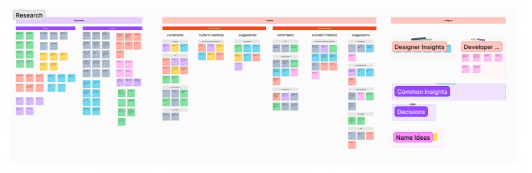
Figjam board of the research process
Insight Generation
Next an affinity map was developed and themes were discovered across the board. The common consensus among designers and developers were migrated as Common Insights and the Actionable Insights among those were made as decisions to develop the product plan.
Common Insights derived from the research
More challenges arose after the insights were generated
The design system was going to be different from the mainstream design systems due to the main insight generated from the discovery research. Most design systems promote uniformity and consistency. However, in this case, the most important requirement was for the system to be customizable and flexible. This was not a problem that could be addressed with a component library.
Product Design
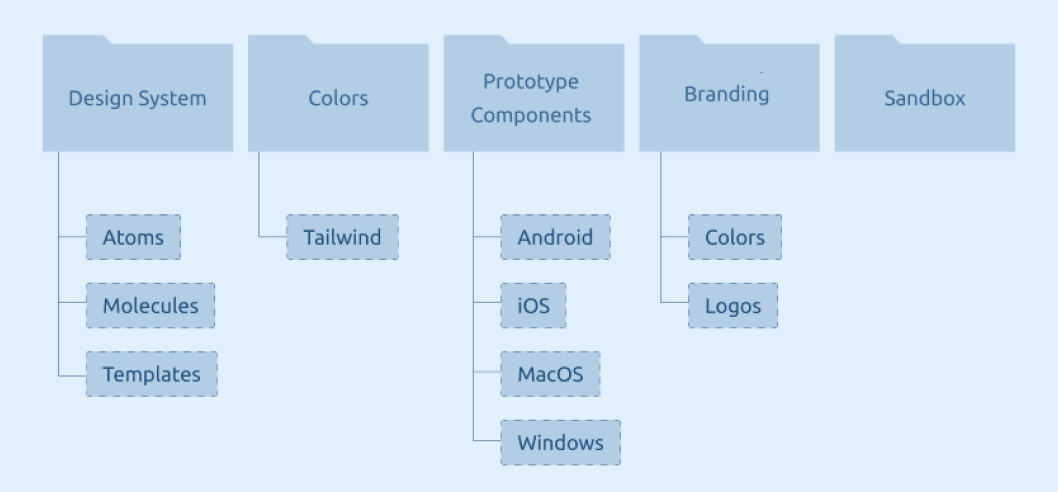
To address the insights derived, the system was broken down into five main parts. Each of these parts added value to the system in their own ways.
Information Architecture of the system
Component Library
The product was to be designed to contain “Template Components”. Template components would be designed as component sheets with Figma Component Properties pre-set to customize essential properties as well as very simple micro interactions pre set. These sheets were to be copied to their own projects to be defined as their own source of truth. If the designer wants to customize the basic properties, they can do so through component properties. If the designer wants to customize further, they can edit their source of truth, just like you would, a developed component sheet. However, then we thought about the problem of accessibility. What if the designer using the system is not as familiar with component sheets? Would they need some guidance in customization? What if the designer wants to bypass developing their own system and use the central system due to time constraints? Well, we had to answer those problems as well.
Methods of Access
Due to those problems we defined three ways of access.
1. Quick Components and Direct Styling
2, Setup Components and Layered Styling
3. Direct Import
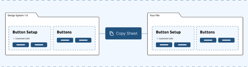
In quick components, the designer could directly copy and paste the quick component sheet to their own project and directly style the component to fit their style. This method is fairly straightforward. They can customize through component properties as well as style them directly. Thus, the name.
Simplified process of quick component importing
Setup components are designed to offer a easier customization experience in the beginning and for the styling to be layered. They are made out of two sheets, the “setup sheet” and the “component sheet”. The designer can copy both the sheets to their own project and go through the offered, step by step customization process to customize everything about the component in the setup sheet. At the end, there is a step to free customize everything as well. After these changes are done, the component sheet will automatically update according to the changes in the setup sheet as the component templates in the component sheet are build using layered instances of the setup sheet components. The designer can use a layered approach to further customize and fine tune the component as well.
Simplified process of setup component importing
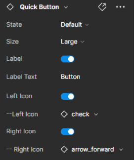
The third and final type is extremely straightforward. If you are in a time constraint and want to whip up a quick wireframe or design, simply enable the Design System from the assets panel in Figma and import the quick components directly. Then a simple customization could be done through the component properties.
Component properties of a basic button after importing
Diverting from the norm… again
Atoms and molecules were fairly straightforward. Import, customize, done. However, when it came to more complex template level components, the level of flexibility and customizability offered by component properties were simply not sufficient. Not every card, or popup will be built the same. They could be drastically different depending on the product requirement. Thus, these required a new method of usage. Usually in the case of design systems, we discourage detaching the instance from the main component. However, with the main intention of the system in mind, we decided to go against the grain.
Import, customize, detach, customize.
The designer can use the template component as a baseline to design their customized component on. Some basic settings are set as component properties for the user to customize. After the basic customization, they are encouraged to detach and import Atoms and Molecules into the layout. Then they can customize to their wits end and save the customized component to their own design system.
To address the insights derived, the system was broken down into five main parts. Each of these parts added value to the system in their own ways.
Testing
Before the system was fully launched, there were three types of testing done in order to test the increase in speed, ease of access and flexibility of the system. There was an overwhelmingly positive feedback on the metrics of flexibility and access. The system was tested on three main avenues to determine if the problem statement was addressed. This was done internally in the design team.
1. Using the central design system over building a design system from scratch.
2. Using the design system over a third party design system
3, Using a design system over a previously library the designer built
In terms of speed, the result was a whopping increase of 120% for building systems from scratch vs building systems using the design system. When it comes to using third party libraries vs the central design system, the increase in speed was over 25% across the design team. Given the fact that this offers, flexibility and customizability above all as well as a system to request components they desire, and the potential to grow into something bigger than ourselves; the product, I dare say, is a success.
A System of designers, by designers for designers
As every good design, the system is designed to be a feedback driven, on going product. The system encourages the designers who use it to leave feedback on a Figjam board.
“You want a new component to be added? leave a sticky. You found a bug or a missing property? leave a sticky. We, the design system team is at your service.”
The design system will be grown over time with the feedback of the team and developed into something bigger, and better.
© 2022. All Rights Reserved to Mino Gallawatta.